Contrast Colours
I cannot help but think this theme always produces strong arrangements because we usually ‘go’ for the obverse – contrast colours of Red/Green, Blue/Orange or Yellow /Purple. As a Teacher I rarely see my students select colours of a softer hue i – they seem to always select the strong rich true colours.
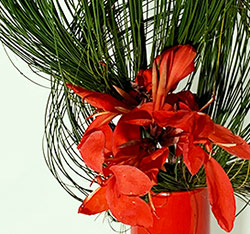
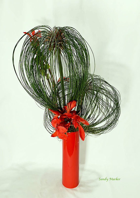
I have done exactly what my students do, chose to work with Red/Green and Blue/Orange. The Nageire arrangement uses large Papyrus heads, curled back on themselves, arranged with red Canna Lily in a red container. In my mind I wonder if the red and green have almost the same strength – maybe a personal feeling. Actually I think I would have made the red stronger and less green.
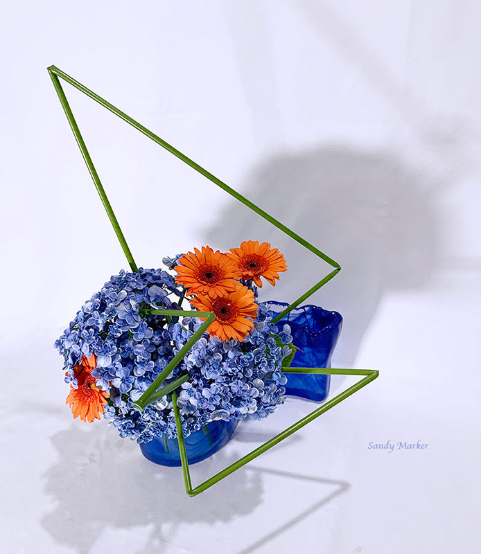
The Moribana arrangement used blue Hydrangeas with orange Gerberas. Before my work was critiqued I used only three Gerbera but my Sensei said when teaching this theme make the Contrast colour a little stronger/larger so the student can fully understand how the contrast colour adds strength.