Contrast Colours
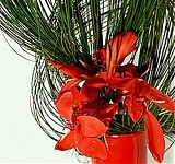
The most recognised contrast colour would be Red/Green, plus it is the fashionable colour for this time of the year. Why do we use contrast colours? It makes the one or other colour really come alive
Read more
The most recognised contrast colour would be Red/Green, plus it is the fashionable colour for this time of the year. Why do we use contrast colours? It makes the one or other colour really come alive
Read more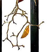
In Ikebana we are always trying to emulate movement into our design – why not create arrangements that actually move?
Read more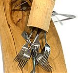
Crazy times require crazy themes. With enforced isolation still in progress many of us have spent more time than usual in the kitchen so with this exposure why not set the theme Anything from the Kitchen
Read more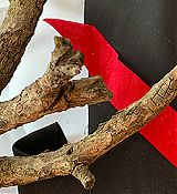
New age ikebana – teaching via the internet. Our first ZOOM get together to share ideas
Read more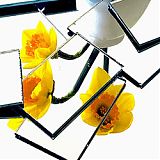
Seeing double – not quite but viewing the floral material from a different aspect makes you think
Read more